Mindscapes Unveiled
By Olimpia Bellan
BEHIND THE ART OF KOHLBEN VODDEN
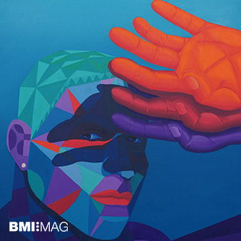
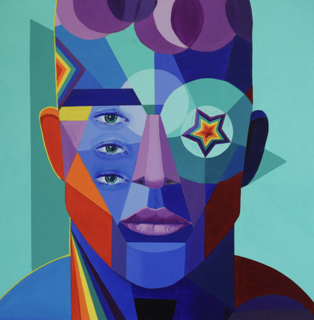
Kohlben Vodden’s art is an explosion of colour and form, where abstraction and figuration coexist in a dynamic interplay. His vivid oil paintings pulse with energy, using geometric shapes and bold hues to explore inner truths, the complexities of human emotion and identity. The fragmented, kaleidoscopic compositions invite us to engage with multiple perspectives, blurring the lines between what is real and what is felt. Each brushstroke seems to carry a rhythm, as if the very essence of human experience is being articulated through movement and colour, allowing viewers to immerse themselves in the emotional landscapes the artist creates.
What’s behind your creative process? And what influences your visual storytelling?
My primary inspiration comes from my obsession with big ideas in psychology and philosophy – concepts that shape our human experience. I consume all manner of content from these domains, allowing my subconscious to push and pull ideas in the background as I move through life.
I don’t consciously decide which concept to work on; rather, I let ideas simmer until they naturally become more salient and relevant through lived experience. Connections form between the theories I’ve absorbed and the events, conversations, or people I encounter. That’s when I know what I need to create next.
Once an idea crystallises, I begin to visualise it both emotionally and figuratively. I consider the emotions I want to evoke, and from there, the colour palette and geometric shapes emerge instinctively. The final stage is bringing the unreal into reality—something that can take weeks or even months to refine on the canvas.
Your work blends traditional techniques with a contemporary twist. What inspired you to merge these two approaches, and how do you feel they complement each other in your pieces?
I thrive on challenging myself and breaking convention. I’m also a stubborn person, so when I was told that I couldn’t use traditional oil paints in non-traditional techniques—such as hard-edge painting – I took that as a challenge.
It took a lot of experimentation, but I developed my own creative process that allows me to manipulate oil paints, which are designed for loose blending, into the tight, controlled hard-edge technique that defines my geometric abstract figurative work. For me, it’s about pushing boundaries and proving that the medium doesn’t dictate the artist—rather, the artist dictates the medium.
How do you draw on Abstract Expressionism and Cubism to create an emotional connection with viewers and transport them into the unreal?
My work explores identity – the tension between the selves we present to the world and our raw, unfiltered essence. I want my art to create a space where viewers can explore those hidden, in-between layers of themselves.
Abstract Expressionism and Cubism evoke curiosity, compelling the viewer to engage with the piece on a deeper level. These movements allow me to fracture and distort visual elements, reflecting the fragmented nature of identity. The result is an artwork that acts as a dialogue between artist and viewer—an ongoing conversation rather than a static statement.
The use of colour in your paintings is striking and bold. Can you walk us through your decision-making process when choosing your colour palette for each piece?
I use bold colours intentionally – to command the space and capture the viewer’s attention. My palettes are informed by colour psychology and the emotional resonance of each hue.
The first step is choosing the dominant hue that conveys the core emotion of the piece. For example, in *The Face of Objectification*, I selected a yellow-green to symbolise the primal, natural world and the excitement of consensual objectification. The rest of the palette—violets, blues, turquoise, and yellow—was built around this anchor, with each secondary colour shaping the viewer’s emotional journey.
I think of colour as a language that bypasses logic and speaks directly to the subconscious. It draws the viewer into the work, allowing them to connect on an instinctive, visceral level.
What role do psychology and identity play in your work?
Psychology is the foundation of my practice. While my works explore many psychological and philosophical themes, two macro concepts underpin everything I create: identity and colour psychology.
Identity is a complex, fluid thing, yet most of us are never explicitly taught to think about it. Instead, we’re conditioned to filter or even perform different versions of ourselves depending on social context. In reality, we are multi-layered beings—contradictory, evolving, and deeply nuanced. My work shines a light on these hidden corners, inviting viewers to consider their own complexities.
Colour psychology reinforces and sometimes contrasts the themes I explore. Colour operates on a subconscious level, evoking emotions that words often fail to articulate. Reds can signal passion or aggression, while blues and greens induce calm or introspection. By carefully layering and juxtaposing colours, I guide the viewer’s emotional journey through the piece.
I use colour to create tension – pairing warm, intense hues with cool, muted tones to mirror the push and pull between external presentation and inner truth. Ultimately, my hope is that viewers feel seen in my work, as if it speaks to both their conscious and unconscious selves.
What current and future projects are you working on?
This is a pivotal moment in my practice. I’m in the late stages of launching a new artistic direction that departs from my abstract figurative oil paintings and pushes my exploration of colour even further.
While colour and colour psychology have always been central to my work, I want to challenge myself to communicate meaning—big, abstract concepts—using only colour and light. I’ve long been drawn to the Colour Field movement, so I’m developing a new body of work that abandons form, line, and value entirely.
To achieve this, I’m working with an ultra-contemporary medium: resin on mirrored surfaces, such as mirrored stainless steel. I dye the resin with alcohol inks, creating semi-transparent layers of colour that interact dynamically with light. The result is a visually dimensional, optically mixed colour field that embodies concepts like *Mastery* or *Acceptance*. I’m incredibly excited about this shift and the new possibilities it opens up.
How visually thirsty are you?
Extremely. As much as I explore philosophy and psychology for conceptual inspiration, I’m equally immersed in visual culture – art (of course), fashion, interior design, and nature.
Read KOHLBEN VODDEN interview on BMI:MAG limited edition, find your copy at @bluemarlinibiza and throughout Ibiza’s hotspots